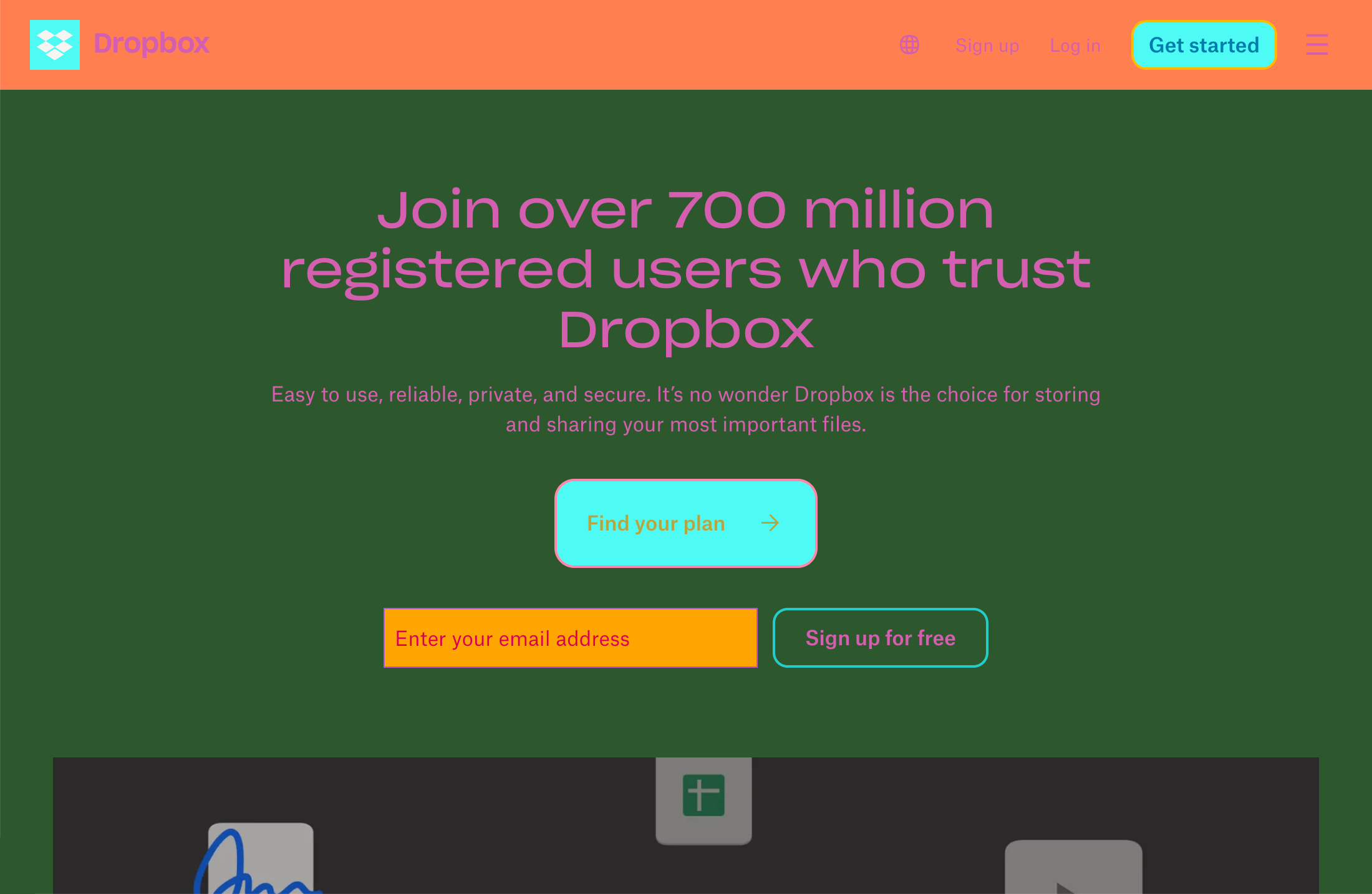
A lot of work goes into making every page and view of a website or webapp look consistent with every other page or view. It’s just good design.
Smaller, newer experiences tend to be more uniform than not. This makes sense in that the bulk of the experience is created at the same time and orchestrated by a small group of people.
Larger, older sites tend to grow into being slightly less invariable. If you have a keen eye you can spot the differences:
- An odd tint or shade here,
- Contrasting border radii there,
- An errant button style unearthing itself from a past redesign, and
- Over here is an errant microsite made by a third party vendor, the long abandoned pet project of a stakeholder who has long-since moved on.
It is sort of like counting the rings on a tree:
- Here’s where flat design overtook skeumorphism,
- Here’s where the brand’s primary color went from royal purple to cornflower blue,
- Here’s where we left the harbor of web safe fonts to download some WOFF files,
- etc.
There’s also even more nuance here, where even specific sections of an overall webpage/view can utilize completely different underlying frameworks. An example here could be, say, a certain popular social code hosting platform:

Coping
Design tokens arose to help prevent this kind of almost-but-not-quite visual leakage and drift. The idea here is you have a platform-agnostic source of canonical truth for things like color, typefaces, line height, border radius, drop shadows, etc.
These primitives are then given a semantic layer of abstraction before being threaded into production code, and voilà! Your color token will be able to quickly and confidently replace cornflower blue with emerald green across an entire experience or suite of experiences.
Reality
The problem is, this only works when you’ve ensured that one hundred percent of your UI is hooked up to your design tokens. And as we all know: in tech the older and crustier something is, the less incentive there is to modernize it.
This means that there is a high likelihood that design tokens won’t be fully integrated in the way they need to be able to succeed. This then means that without intervention, the gap between new features and existing UI will widen as time goes on.

Since this sort of technical debt is invisible and unglamorous, working on it often gets kicked down the road to some future never date. After all, why fix it if ain’t broke?
The truth of the matter is that eventually something can conspire to call in the accumulated technical debt. And when that happens, scope becomes a disastrous force multiplier for scale.
Flip the script
Design tokens are often thought of as a way to keep experiences harmonious between different modes and themes. However, I wonder: what if we flip the idea around and make things ugly?

A discordant palette of randomly-assigned colors will throw the difference between parts of the experience that consume design tokens and parts that have yet to be updated into sharp relief.

Making an ugly mode
In terms of structure, an ugly mode can exist in parallel with your dark and light mode themes:

The mechanism to create it is as chaotic as it is straightforward. All you need to do is take each color value you have, and replace it with a random color value.
Your inner systems designer may be cringing at this lack of higher-order logic, but I encourage you embrace the pandemonium instead. After all, that’s what’s going to make the mode so effective.
See what I see
More mature design systems can quantify this sort of gap programmatically and boil it down into a number on a dashboard. And while there is value in this, a number on a dashboard is sterile and impersonal.
To counter this, a design token ugly mode is a direct and powerful way to visualize the current state of the world.
It’s one thing to set ugly mode on a local feature branch on your own computer. It’s another to create a feature flag and add other people to it.
Remember that keen eye I mentioned earlier?
The reality is some people don’t, and won’t have the kind of sensibilities that can pick up up on this level of detail—or much less care about it. The act of switching on design token ugly mode is a way to recontextualize that percentage coverage buried away in some forgettable report, and instead make it immediately apparent.
This could be helpful as a technique to get prioritization for things that need attention from the kinds of people who normally don’t value this sort of thing. The important bit here is asking for their consent to do so first.
Squint and learn
Another thing you could do is tie design token ugly mode into any page/view-level visual diffing automation you might have set up.
You could then see where “blotches” of content where ugly mode is less prevalent to better identify what areas need attention. This could be an effective way to get a better holistic view of team or service area adoption efforts:
Dear god, it’s hideous
Design tokens are all about promoting and reinforcing uniformity and consistency. Two issues with utilizing them effectively is needing universal adoption, and the prioritization of effort that that level of adoption requires.
Ugly mode is a way to take this abstract, invisible concern and make it obvious and impossible to ignore. It leverages the strengths of design tokens and uses them in an unexpected way to help communicate their purpose and value.
I personally have not had a chance to implement ugly mode on anything past experimentation on personal projects, hence the prefix of this blog post’s title. If it is something you manage to pull off in a professional capacity please let me know!
