I would like to thank Modern Health. It was not their intent, but using their service broke me out of a deep depression by launching me into an incandescent rage.
I’ve read enough on destigmatizing mental health that I feel no shame in discussing this. In fact, in this regard I feel twice fortunate. The first is to know enough about myself to know I need help and not feel bad about it, and the second is that I have an employer-offered benefit to take advantage of.
You need to use every resource you can for things like this, and there is no shame in doing so. Mental health resources, like physical health resources, are in incredibly short supply right now.
I signed up for Modern Health’s service earlier this week. After signing my rights away by clicking an impressive number of checkboxes, I was greeted with this experience:
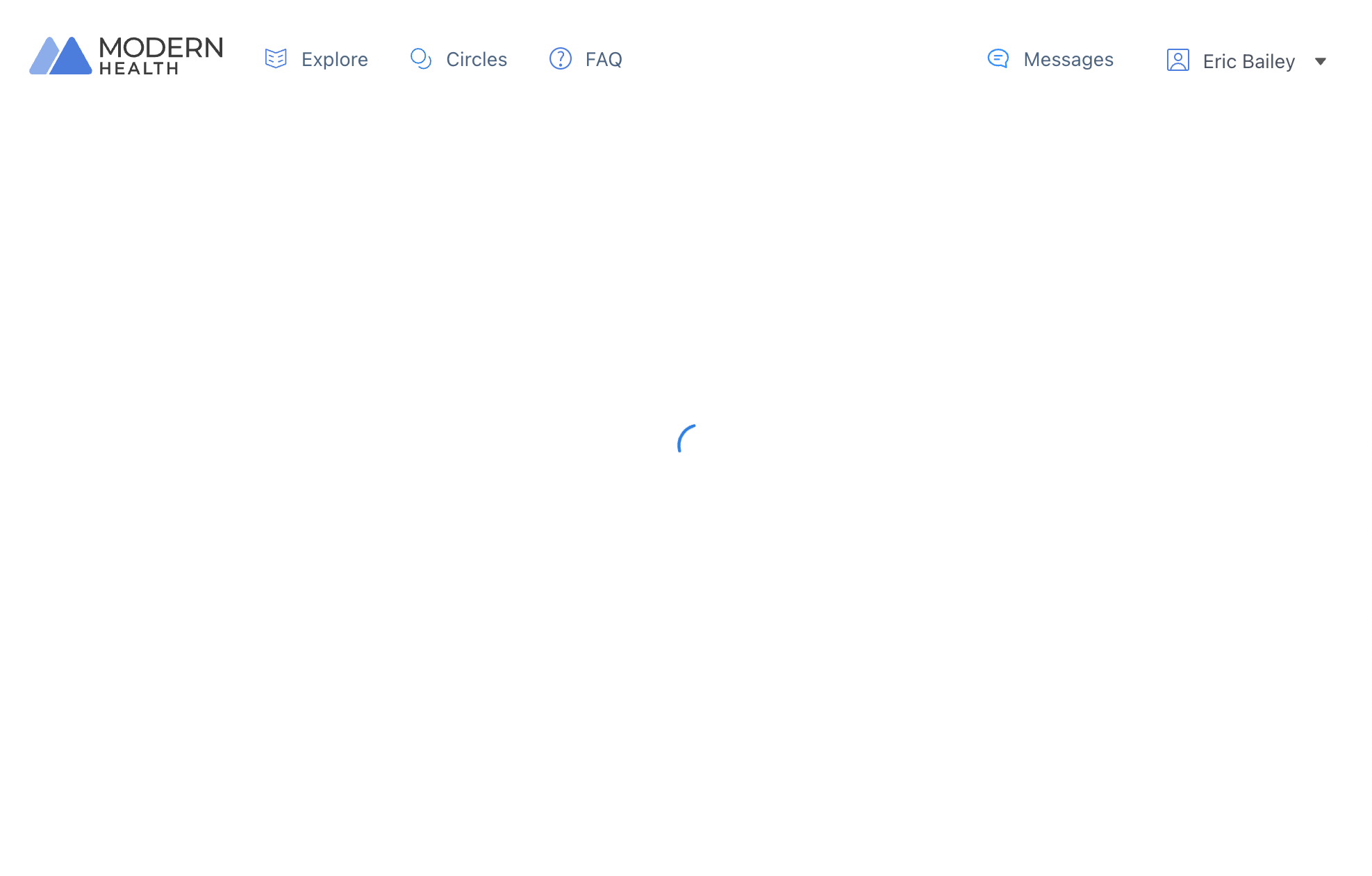
Since I make digital experiences for a living, I immediately knew what happened. The signup user flow failed to transition me over to the onboarding user flow.
In addition to a terrifying amount of telemetry, Modern Health’s customer-facing experience is delivered using React and Webpack.
If you are familiar with how the web is built, what happened is pretty obvious: A website that over-relies on JavaScript to power its experience had its logic collide with one or more other errant pieces of logic that it summons. This created a deadlock.
If you do not make digital experiences for a living, what happened is not obvious at all. All you see is a tiny fake loading spinner that never stops.
Experiences on the web are so poor that many people have developed coping strategies for getting what they need. I hard refreshed the tab and was unceremoniously dumped into my homepage dashboard. Many others may know to do the same.
However, many others is not everyone. I also need to point out that people are visiting sites like this because they are not in a good place. Depression and stress lowers your executive function. Furthermore, people internalize technology’s failures as their own.
What if I was suicidal?
I used an up-to-date operating system to access this website on a top of the line laptop, browsing with an evergreen Chromium browser with no setting adjustments or extensions to interfere with things. Can you imagine what chance for success someone using something other than that will have?
Technology choices have ethical ramifications.
A person seeking help in a time of crisis does not care about TypeScript, tree shaking, hot module replacement, A/B tests, burndown charts, NPS, OKRs, KPIs, or other startup jargon. Developer experience does not count for shit if the person using the thing they built can’t actually get what they need.
There is also the very real possibility that the developers responsible for making this experience do actually care. However, they may be structurally unable to deny stakeholders demanding an onslaught of non-features, in an attempt to parrot other startups in hopes of reproducing their perceived success.
I felt compelled to write this because explaining the situation is a fractal of absurdity. I’d be laughing if I wasn’t so furious.
I mean it. Take some time today to try and verbally explain the totality of what went wrong here to someone who doesn’t make digital experiences.
Try to justify the architectural choices made compared to an intended audience. Then try to re-justify it through the lens of power dynamics and and a vulnerable population.
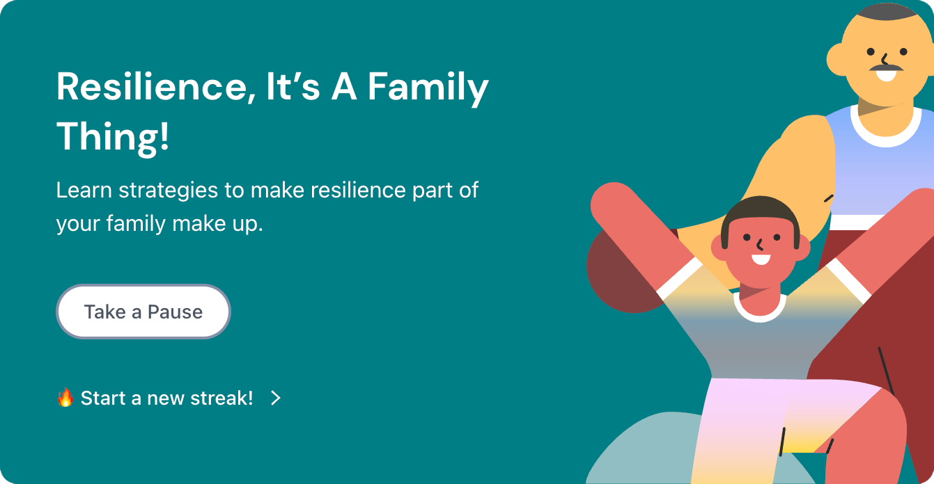
An experience like Modern Health should be as lean and fault-tolerant as possible. It should not make 162 requests transferring ~15 MB just to hope it can show me two sanitized Corporate Memphis blob humans promoting a gamified growth funnel.
I don’t want the underlying concept behind Modern Health to fail. I want more people to get the help they need in a reliable and safe way. However, I wish we as an industry would stop promoting and rewarding the wrong things.
We’ve lost the plot. Performance, accessibility, and usability are more than inconvenient truths you can pretend don’t exist. They have a direct impact on the quality of someone’s life.