The lack of nuance you can explicitly express as an individual is one of the many, many things I dislike about the algorithmically-determined content recommendation systems we are trapped inside of.
These preferences are instead inferred via system-observed behavior. They are also only as sophisticated as the teams responsible for creating the automation to sort and categorize the inputs and events the system has access to.
The complexity of a thinking, feeling person in the world cannot be distilled down into a JSON file. This is immaterial to the systems that compel and collect this data, and I resent this fact.
It is difficult to come to terms with these imperfect digital systems, how they evaluate and categorize us, and how they fail to represent who we truly are and what we wish to be. Don’t even get me started on the automated decision-making aspects, either.
As an optimist, we wouldn’t have these systems at all. As a realist, I wish we could at least directly access and edit these profiles. This is a gentle way to say I am often found wanting by how I am represented.
I’m sure some academics have written about this extensively. That said, here’s some tongue-in-cheek suggestions for how we could help these systems capture some of that complexity via explicit, direct human input.
For this, I’m targeting Netflix. To be specific, it’s “Love this!” icon that is almost, but not quite re-instituting a five point rating scale is what set me over the edge:
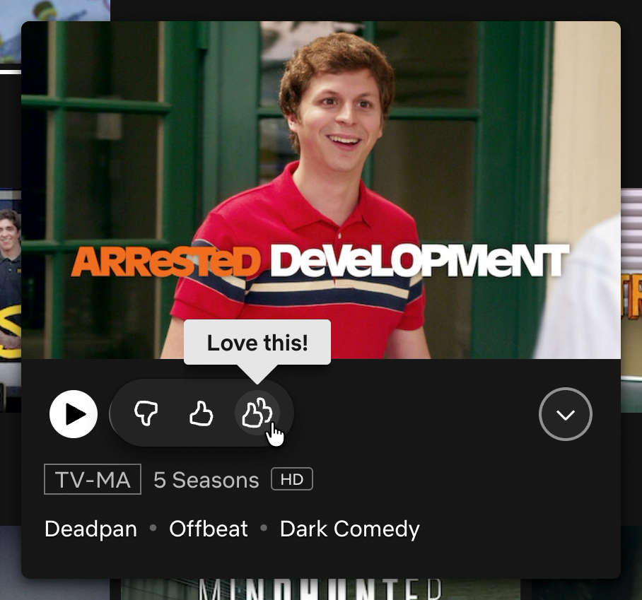
Setting aside corporations’ aversion to negative sentiment for a moment: It is easy to imagine a world where a “Hate this!” icon is also instituted, thus helping to flatten all human interaction into a more legible simplified schema.

What if we got weird instead
Following are some ideas of new rating buttons we could use, to better explicitly capture the nuance that apparently comes with the humble act of watching streaming media:
I’ll watch anything with this actor in it

Don’t suggest anything with this actor in it

My parents are visiting and I settled an argument with this

Just because I expressed interest in this show does not mean I want to be inundated with recommendations for its genre

Disregard, my cat walked over the keyboard

I was re-watching this to see if it held up, it didn’t

I was re-watching this to see if it held up, it did

I want to impress someone with my taste in media but am not super committed to it past that

Sprinkle this in periodically to occasionally break up the monotony

I realize a studio paid you to push this but its over-weighted presence makes me less overall inclined to use your entire service

I am watching this in full even though it is not good because I want to ensure the metrics look good for future, better efforts in the style of this

We don’t need more of this, let a good series quit while it is on top

Blast notifications for a content update to this series across all possible channels I use to receive notifications

Please forget I ever watched this, then scrub the record that listed I wanted this forgotten

I am making bad choices and hatewatching this while my partner is asleep

This is a guilty pleasure, don’t list it—I’ll find it

It admittedly does make for a rather cluttered UI. But hey, I’m only half-joking here:

Other suggestions
- Tell my child this show is broken and won't play until they take a bath, via Elaina
- Please don't show this latest episode of a series as watched because I told my partner I wouldn't watch it without them but I lied, also via Elaina
Got some suggestions of your own? Let me know!