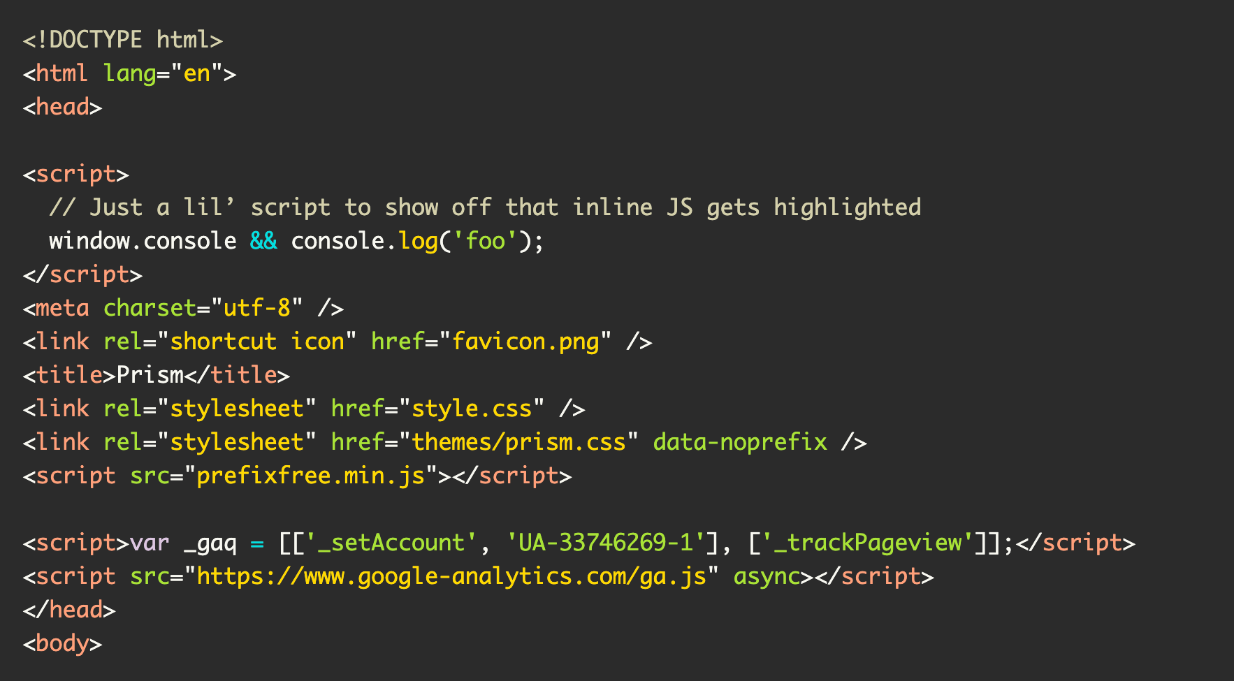
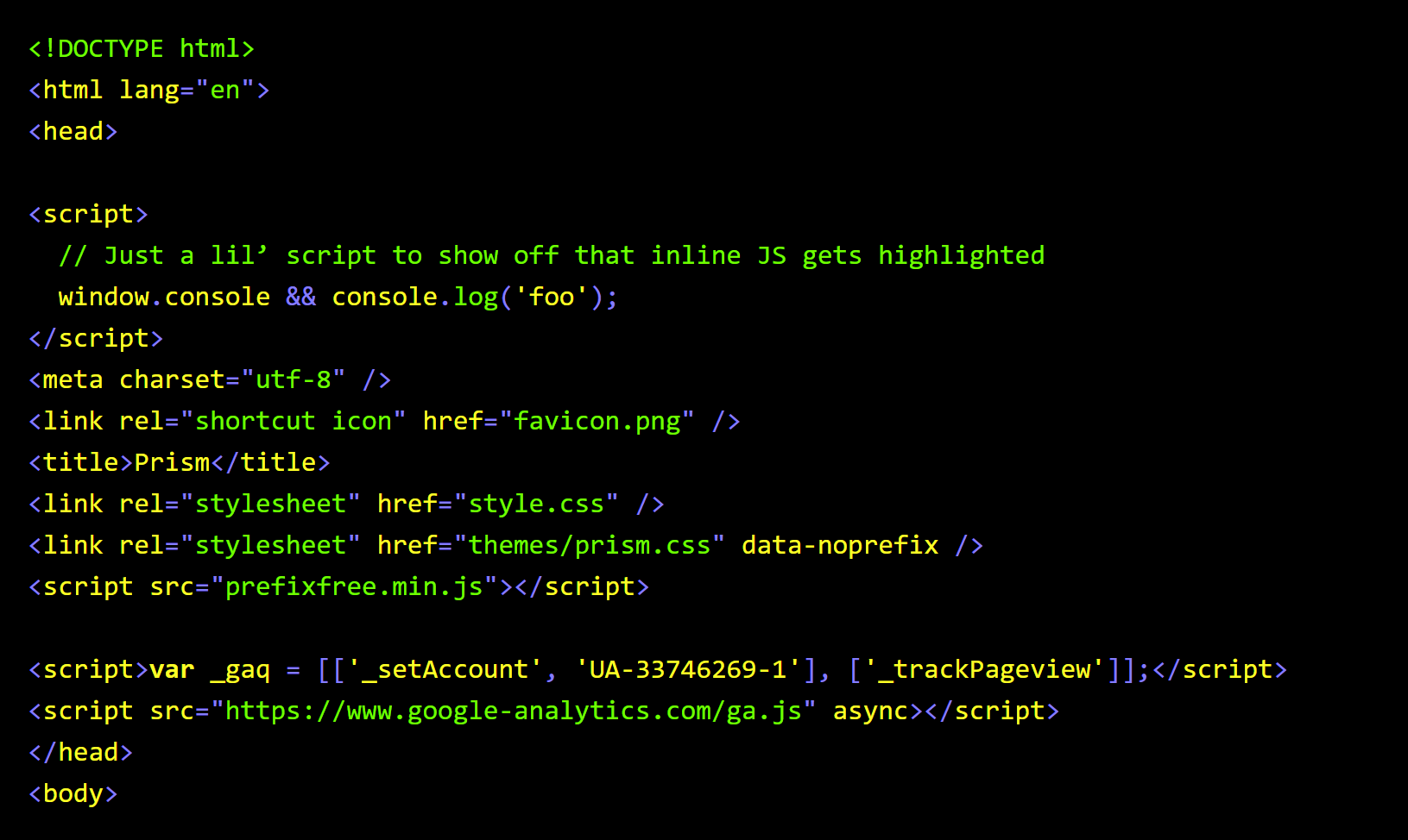
I created the a11y-syntax-highlighting library seven years ago, forked from xiaozi’s solarized-prism-theme for PrismJS.

To not bury the lede, the new update:
- Supports Forced Colors mode,
- Is encapsulated in a Cascade Layer,
- Uses Custom Properties,
- Groups its selectors using the
:where()pseudo-class function, and - Normalizes color value declarations to all use
hslanotation.
It also offers options for supporting Operating System dark and light color modes:
- For a dark code background color for dark mode and light code background color for light mode, use
a11y-light-on-light-dark-on-dark.css. - For a dark code background color for light mode and a light code background color for dark mode, use
a11y-dark-on-light-light-on-dark.css.
There are also standalone dark and light code background offerings that do not adapt when the OS mode changes. These stylesheets are called a11y-dark.css and a11y-light.css.
Background
The project was started in response to a question Michael Ball asked on the web-a11y Slack instance. He was asking if SC 1.4.3 Contrast (Minimum) applies to code syntax highlighting themes.
The answer is yes. Code syntax highlighting themes need to meet minimum color contrast values to be conformant.
I then realized there weren’t a lot of syntax highlighting themes that were fully conformant. Many of them fell apart with the colors they use for comments.
I understand that there may be a desire for code comments to look less visually emphasized. However, code comment color—like all other text content—still needs to be able to be read.
Naming the problem means owning the solution. Because of this, I created the library to address this gap in support.
I also put a lot of effort into selecting color values that did more than just conform. Accessible experiences can be beautiful experiences, and I wanted this to reflect that.
I initially targeted the PrismJS project because of its popularity. highlight.js support soon followed. I also added themes for Carbon, as sharing images of your code on social media is apparently something people like to do.
While doing this work, I also realized I could also support Windows High Contrast Mode. I haven’t encountered any other syntax highlighting theme that does this, so I wanted to offer an option.

Putting it all out there
I’m always pleasantly surprised to see other people use the theme when browsing the web, and was floored when the W3C Design System adopted it.
I also love that folks contribute to the project to make it even better. I’d specifically like to give kudos to Reuben L. Lillie for Vim support.
Another person I’d like to thank is Elly Loel. She opened an issue asking about support for the more contemporary, standards-based Forced Colors media feature.
It took me longer than I’d care to admit, but the latest release of the library address her issue, plus a lot more!
I could lie and say it was me waiting for more broad browser support. However, the real answer is last year’s events took a lot out of me.
I’m in a better place now. This update is an output of the effort I’ve been taking to take better care of my physical and emotional health.
We often forget that there are human beings at the other end of the software we use. It’s a fact that I hope you keep in mind the next time you go to file an issue. To that point, I’d like to thank Elly again for her patience and grace.
More about the updates
CSS has gotten really good as of late. I’d like to talk a little more about the newer features of the language that I used, because I feel it’s worth giving them more attention:
Cascade Layers
PrismJS uses very generic class names like token and number. This isn’t necessarily a bad thing, but it does mean style leakage could happen via class name collisions.
Putting the styling instructions for this library inside a Cascade Layer means this issue could be more easily dealt with, should it occur on your site.
:where()
Using :where() makes a lot of sense for grouping selectors. It also keeps the specificity lower, should you need to do additional styling work. This means less tricks and nasty hacks, which means code that’s easier to maintain.
CSS Custom Properties
The themes’ colors and measurements are also more easy to manipulate to better work for your content’s visual needs. A good example here would be overriding --prism-a11y-font-family’s value to use whatever font you use for your website.
Additionally, Forced Color Mode works beautifully with CSS Custom Properties. I wrote more about the technique for Smashing Magazine, if you’re interested.
hsla()
Being able to use transparency was helpful for supporting PrismJS’ line highlight plugin. I’m also hoping I can thread relative color functions in down the line when support gets more widespread.
Where I’d like to take this project next
Speaking of what’s coming down the line, I’ve revamped the roadmap.
The only thing I’m going to focus on now is a Microsoft Visual Studio Code theme. I’m only going to do that if there’s expressed interest, however.
Cleaning up the old roadmap also removed a lot of obligations I created for myself—I now realize that they were contributing unnecessary background stress and guilt.
The other thing I’m ambiently curious about is GlyphDrawing.Club’s magical Font with Built-In Syntax Highlighting. I’m not going to try and create a whole new typeface from scratch, however.
I’m also open to supporting other popular syntax highlighting libraries if enough interest is expressed. External contributions are welcome, if you’re willing to put in the effort.
Here’s to seven more years
It’s been a little bit of a trip to reflect on who I was when I started this project, and where I’m at now. To that point, I’m curious to see where the project will go from here.
To the point of that point, let me know if you use the theme for your project! I’d love to include your site on the README.