In the spirit of “everything old is new again,” browsers are once again supporting the ability to style the scrollbar. Much like custom CSS mouse cursors, I feel this is also a mistake.
When you style things on the web, you get control over almost the entire experience. From ten thousand feet up, your scope of concern is this:
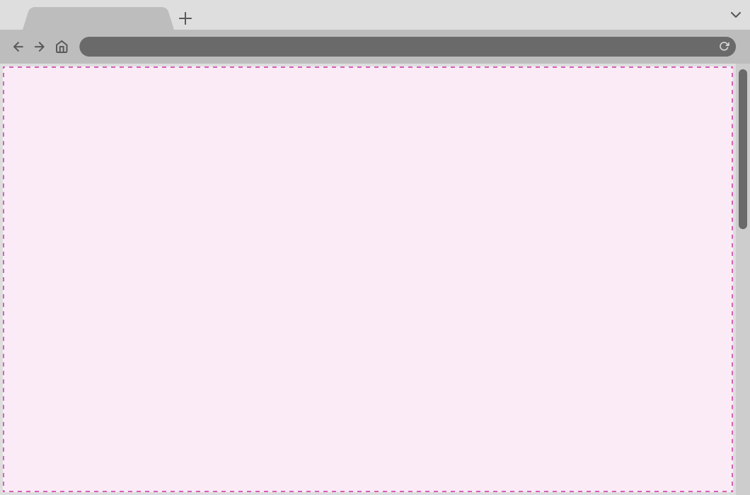
The scope of concern for the browser is this:
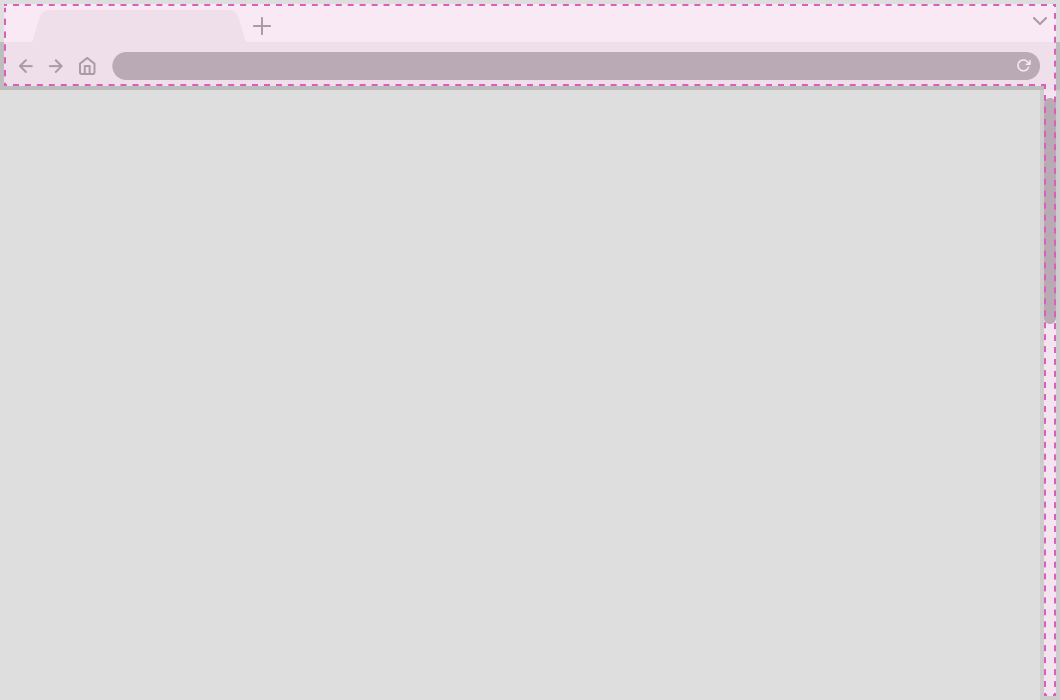
The browser’s UI is informed by the operating system it is installed on. This is important to note.
Browser UI is used to help create consistency across the entire experience of using a device. When you deviate from these standards, you introduce ambiguity.
Ambiguity means less certainty about what the piece of UI is, how you interact with it, and what effects taking action on it will cause. The more you deviate, the more confusing things get.
This phenomenon is why checkboxes use squares and radio buttons use circles—even with flat design removing depth and texture from everything.
We may be long-separated from car dashboards using physical press knobs, swapped out in favor of dangerous, inefficient touchscreens. However, the metaphors drawn from these physical equivalents still persist.
Scope of concern
Scrollbars are part of the area of the browser that is outside your scope of concern.
Some may argue with this and claim that being allowed to style them with CSS means that it is fair game. However, I think there are some accessibility considerations that were not taken into account before this capability was given to us by the platform.
Questions to ask yourself before customizing your scrollbars
Following are a list of questions you should ask yourself if you’re considering modifying your scrollbar’s visuals.
The control
For reference, this CodePen is what I used to perform my testing:
Can your branding succeed without scrollbars being customized?
Custom scrollbars, like custom mouse cursors, can styled to help reinforce the branding of a website or web app. Just because you can, however, does not mean you should.
Ask any successful marketing agency—branding is so much more than how something looks. You probably need to find a new brand strategy if your entire outreach efforts depend on a scrollbar’s appearance.
Do you need to make someone download that extra data?
Spoilers: you don’t. Scrollbars work without CSS.
You might be scoffing at the kilobytes this removal represents, but when it comes to web performance, every little bit counts. Through the ruthless lens of performance optimization, this is unnecessary data to force someone to download.
Network throttling, metered data plans, dead zones, and many other factors beyond your control are all forces you need to contend with. Better to prioritize sending styling information for your website or web app’s actual surface area.
Will your custom scrollbar colors pass color contrast?
If someone can’t see something, they won’t know it is there. If they don’t know it is there, they won’t take action on it. It’s as simple as that.
A history lesson
Apple learned the lesson about visible scrollbars the hard way when it introduced its ultra-minimal, disappearing scrollbar indicators:

There’s no visual indication that there’s more content present in this window—the only way to discover it is to scroll downwards. However, without an affordance to indicate the presence of additional offscreen content, the chances are low that someone will bother to check.
Video description
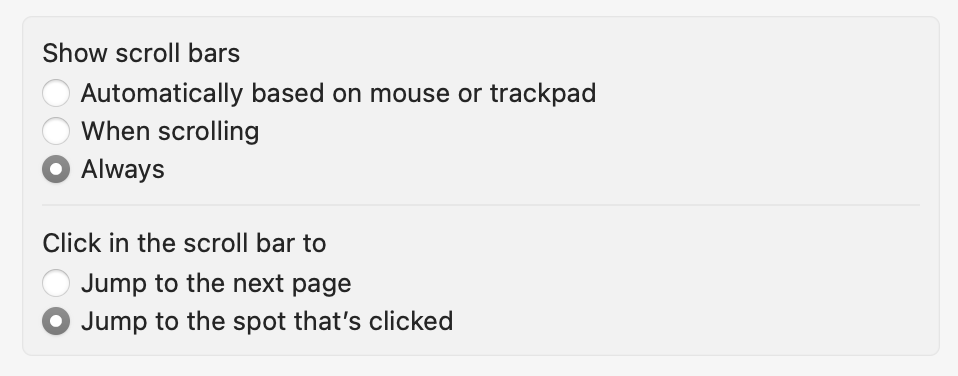
The same list of files in a Finder window as the previous image. This time there is a slow downward scrolling action and a scrollbar reactively appears. Files 15 through 42 are then revealed from the bottom of the Finder window's viewport, continuing the grid. Once the scrollbar reaches the bottom of the available content area there is a slight bouncing effect to comminicate the end of the content. After reaching the bottom there is another, faster scrolling action to return back to the top, with the same subtle bouncing effect at the top of the available content area. After reaching the top the scrollbar fades back to being invisible.This is why Apple introduced a preference to always show scroll bars. Think of this preference a lot like their introduction of the reduced motion accessibility toggle, where a setting had to be introduced after the general public revealed that their novel idea actually made things worse for a lot of people.
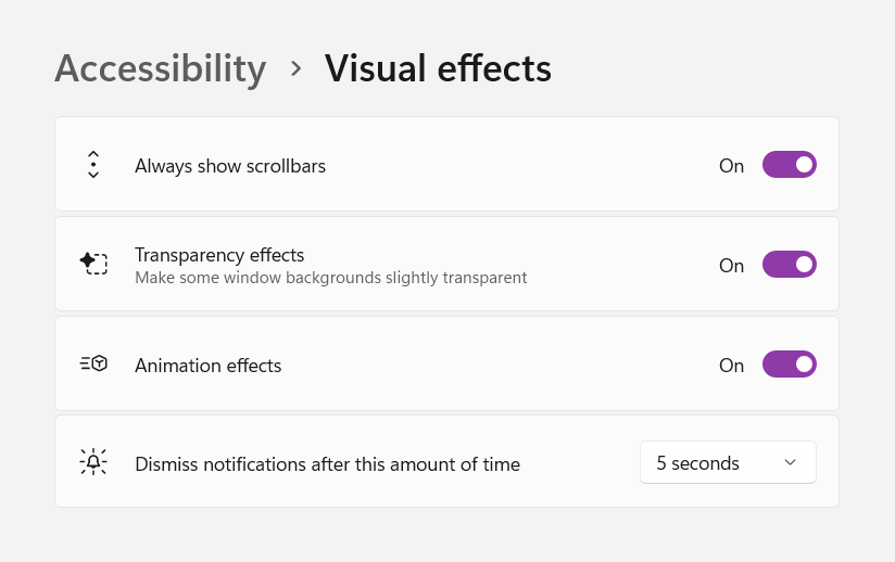
Windows followed this path blazed by Apple, and also had to set up their own preference to deal with this issue:
As an aside, I set the operating systems I use to always show scroll bars. It’s a good way to help uncover, debug, and remove overflow issues in your CSS. It’s also a great way to get irritated by people who don’t.
WCAG
If you modify the Operating System scrollbar’s appearance, it is now on you to ensure that it meets Web Content Accessibility Guidelines criteria. This criteria includes minimum viable color contrast.
Specifically, the immediate concern is Success Criterion 1.4.11: Non-text Contrast. This criterion is level AA, which is the typical level most websites and web apps target, and is not a specialized concern.
I’m not going to get into the particulars of how to meet this success criterion this since I don’t think you should be modifying the scroll bar’s appearance in the first place. That said, you’re now aware it’s an issue so you can’t claim ignorance.
Will your custom scrollbar colors defer to a user-set theme?
Windows 11’s shiny new UI is another coat of paint slathered over previous editions. As you peel back these layers, you find the UI and functionality of versions of Windows past.
One of these older features with a new coat of paint is the ability to theme Windows. Themes allow you to specify the wallpaper, sounds, accent color, mouse cursor, and other qualities and quickly swap them into pace.
Themes are also portable, and are shared as .theme or .themepack formats. Windows offers its own official themes. There are also websites that aggregate, categorize, and share themes people have made.
Some Windows Themes adjust the scrollbar’s colors. From my testing, custom CSS scrollbar styling overrides this:
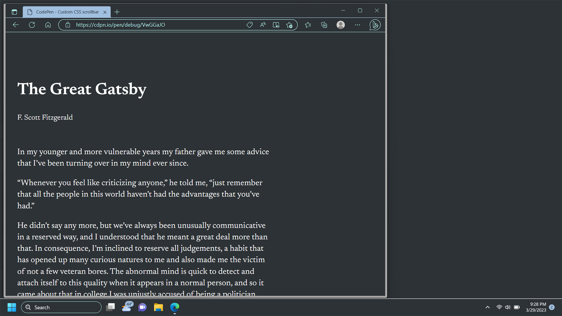
If I could wager a guess, it’s likely that theme colors tie into Forced Color mode concerns behind the scenes (more on this in a bit).
The mechanism that orchestrates a Windows theme is immaterial to the overall point: Your decision to adjust the scrollbar is overriding someone else’s explicit preference.
We also don’t know why someone is changing their theme. For some, it could be aesthetic sensibilities. For others, it could be adjusting things to lessen/increase contrast, or create more uniformity. It might even be a combination of the previous.
While this sort of OS customization used to be more popular, it is still supported by Windows and likely has tens or hundreds of thousands of people using the feature. When it comes to accessibility, it’s also a terrible idea to make deciding who and what to support a popularity contest.
Customizations like this are deeply personal. They might be for:
- Access reasons,
- Personal aesthetic preferences, or
- A combination of both.
When you override this expression, you’re indirectly communicating that someone’s personal preferences are less important than your own visual sensibilities.
You also can’t detect the presence of a Windows theme via CSS or JavaScript. This means you can’t conditionally remove custom CSS scrollbar styling. Again, better to proactively accommodate and not modify the scrollbars in the first place.
Will your custom scrollbar colors honor specialized display modes?
I have some bad news for you.
In the continuing theme of “you own responsibility for it if you modify it,” there are two important truths you need to learn:
- Scrollbars modified by CSS don’t automatically adapt to honor specialized display modes, and
- Every custom scrollbar CSS generator tool I evaluated didn’t include code to accommodate this.
It’s worth directly stating that these display modes are highly personal customizations. This includes avoiding experiencing pain or discomfort, all the way to the feature being the one thing that makes using a device actually viable.
The affected modes are:
Forced Colors mode/Windows High Contrast mode
Forced Colors mode replaces all colors on the Operating System with a palette chosen by the person using it. It can be used to increase the contrast to a level that works for someone with low vision, or decrease the contrast so visuals are less vibrant and more uniform.
Modifying the scrollbar via CSS means the scrollbar will effectively disappear when a Forced Color mode theme is applied. Again, if you can’t see it, you won’t know it’s there.
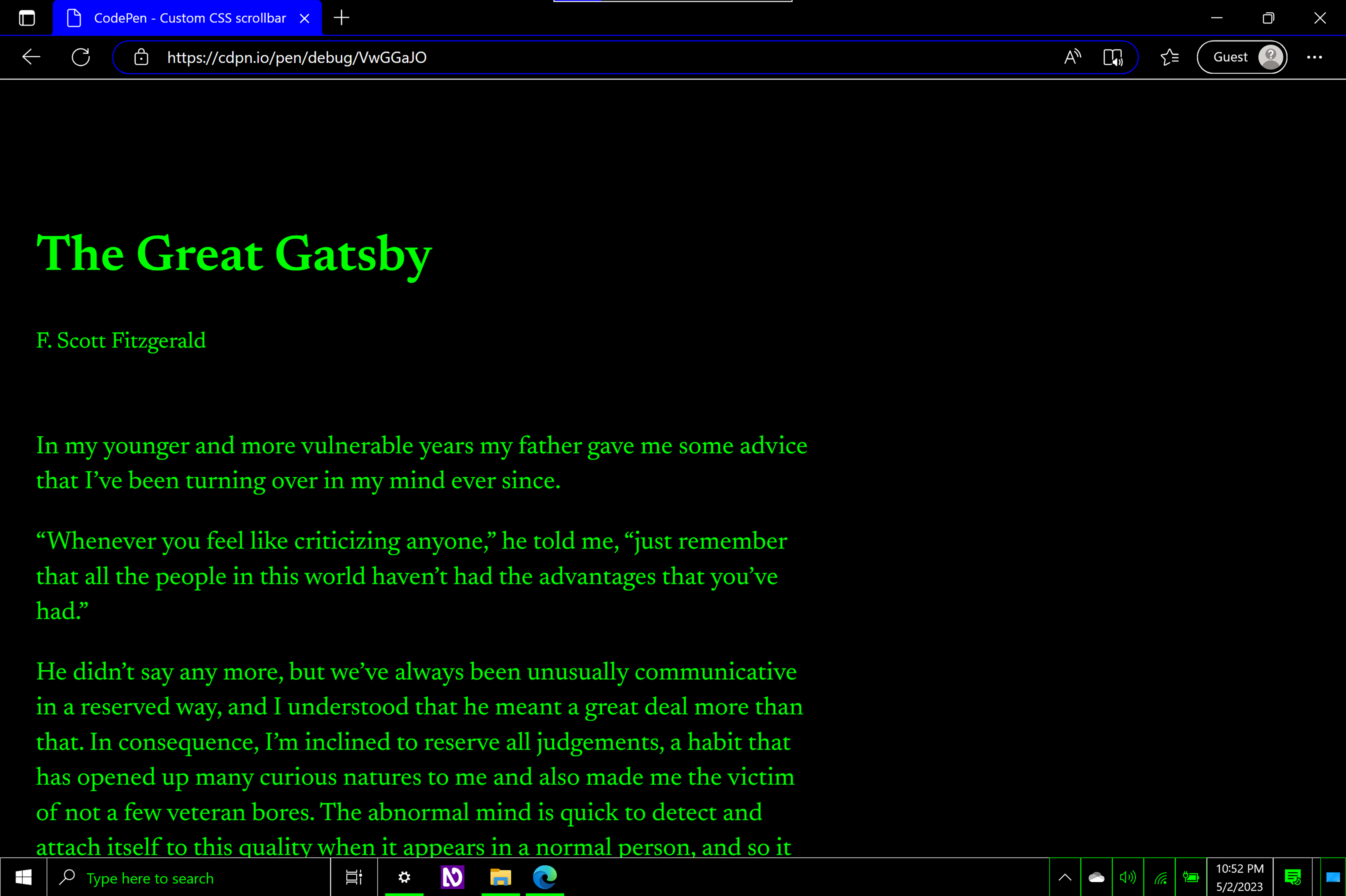
Increased Contrast mode
macOS and iOS support the ability to create more visual distinction between different parts of the Operating System UI. This is separate from Forced Colors mode/Windows High Contrast mode.
Curiously, the border that separates the scrollbar from the content in Finder is exempt:

Non-Chromium browsers (Safari and Firefox) will apply a higher contrast scrollbar treatment when Increased Contrast Mode is active. It may require a refresh to trigger.
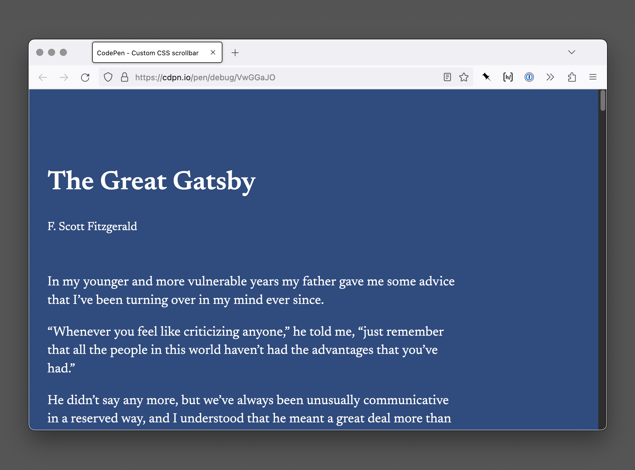
Much like with Forced Colors Mode, custom CSS scrollbars will not honor the presence of an enabled Increased Contrast Mode.
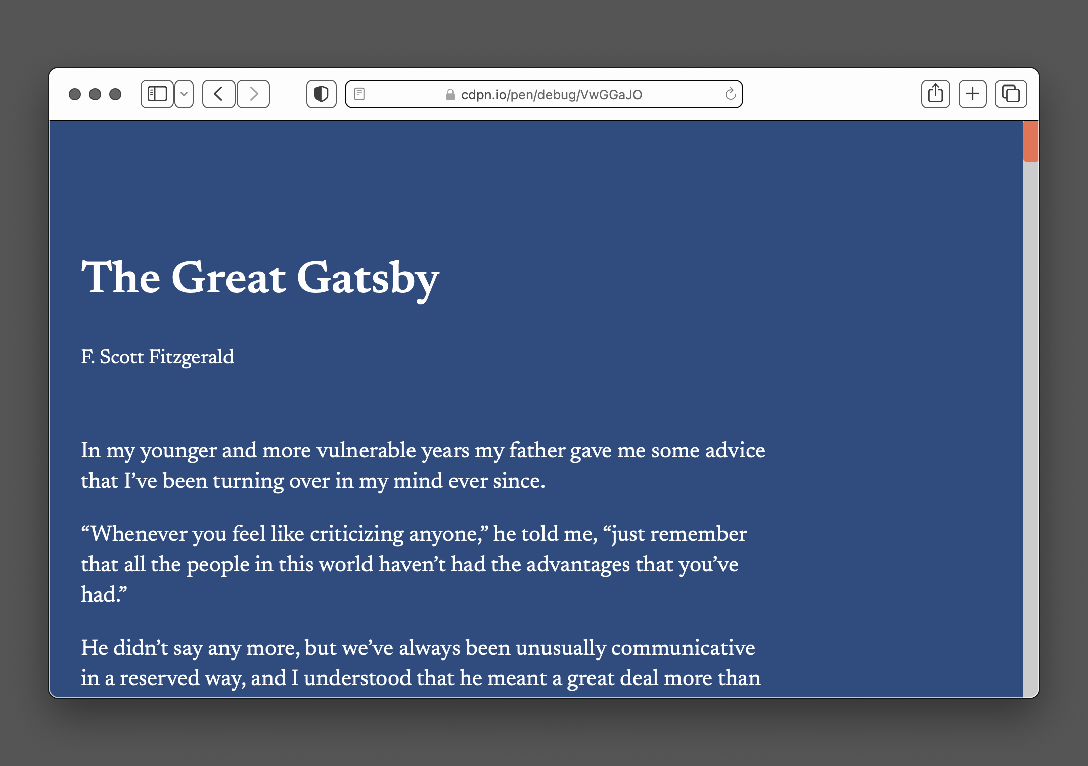
Considering that the entire reason for increased contrast mode’s existence is to create more obvious and defined sections of UI, you want to preserve this predictability.
What about inverted colors mode, filtered colors display mode, and reader mode?
I am happy to report that these modes gleefully accommodate or ignore your custom scrollbar CSS and do their thing.
It’s still worth mentioning these modes here, in that they are often overlooked by people when creating digital experiences. You don’t need to create a suite of bespoke treatments here. On the contrary, you can do more by doing less by not touching the scrollbar’s appearance.
Is the touch target area large enough?
Again: If you modify the operating system defaults, you take on the responsibility of owning it.
Too narrow
There is nothing stopping you from making a scrollbar 1px wide. Or 0.5px. Or 0.025rem. Or any of the other minuscule widths I tested.
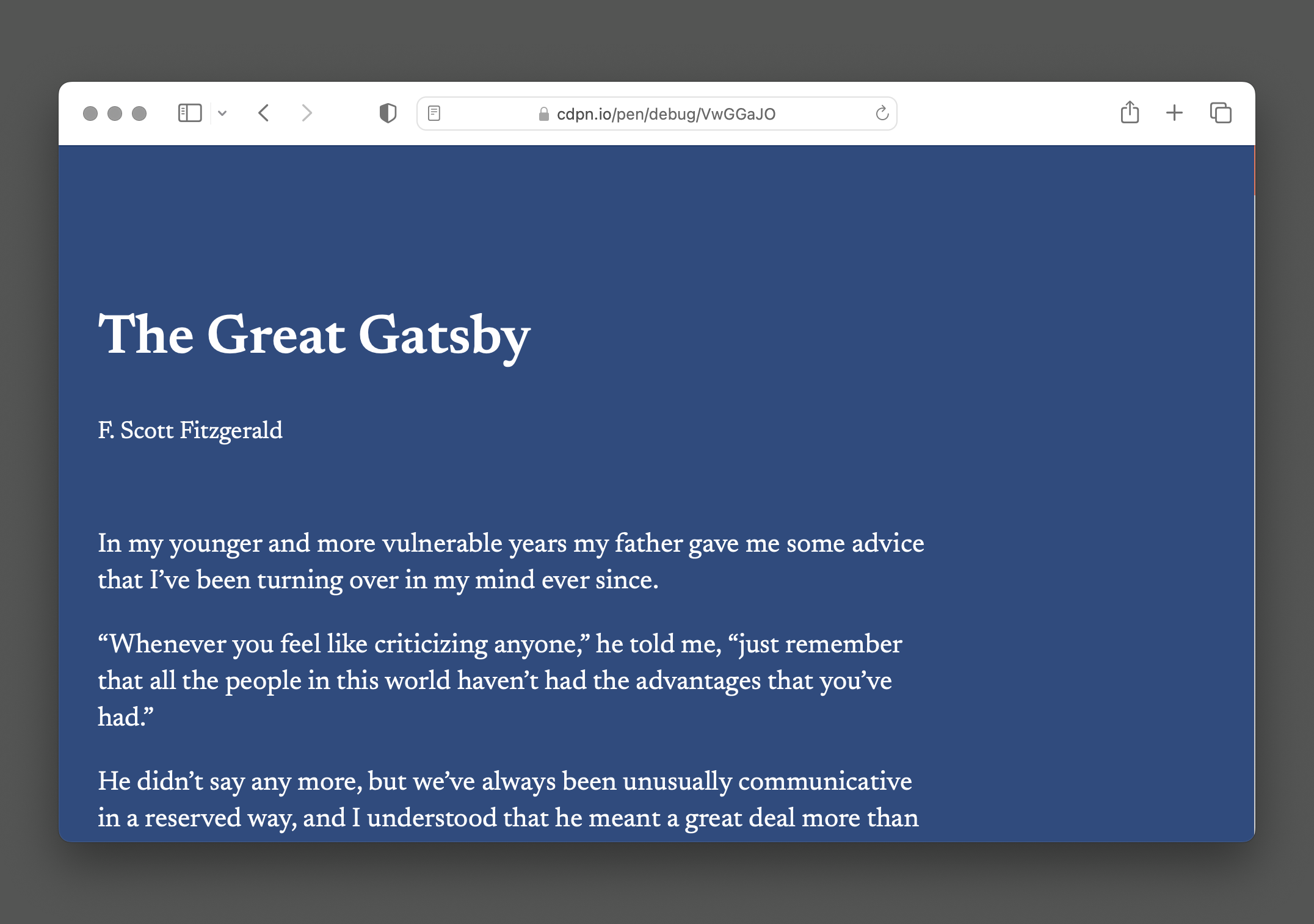
1px.
No automatic guardrails are present to prevent someone from making a scrollbar so narrow that it can be next-to-impossible to click on. I shouldn’t have to list out all the reasons why this is an issue.
Yes, people can override this override with extensions such as Stylus, but that presupposes that people have:
- The awareness of these kinds of resources,
- Devices capable of using them,
- The technical expertise needed to undo the modifications, and
- The stamina to sustain this for every website and web app that does this.
The browser does not have your back here. There are no controls, preferences, or other buried features I’m aware of that can tackle this issue. Browsers have a ton of work to do in this sort of area, but it is simply not a priority.
Modifying the operating system scrollbar width
Windows lets you globally adjust the scrollbar width via modification of a registry value. It affects any and all applications that use operating system scrollbars. This includes browsers you have installed, unless a website or webapp uses a custom CSS scrollbar treatment.
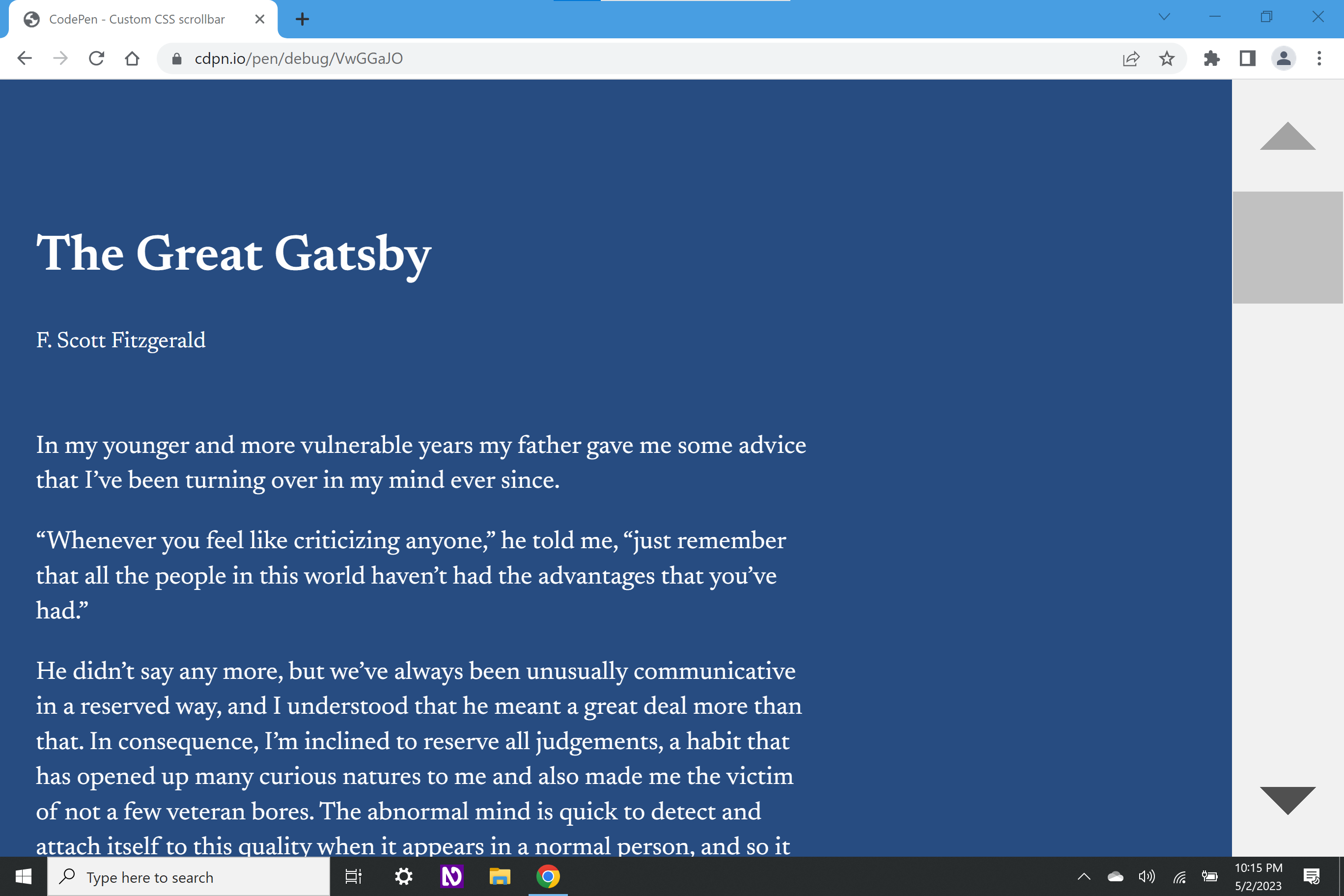
I’m pretty sure macOS does not let you modify the scrollbar width, either via its UI or its large collection of hidden terminal commands. Linux is a bit of a big question mark to me, in that there are so many different variants out there that I’m sure it’s possible from a sheer probability perspective.
It’s also worth noting that Windows is incredibly popular, despite most of contemporary web development being done on macOS. We often tend to forget that.
Not my width
While being able to adjust the scrollbar’s width via CSS may increase the touch target size to generous proportions, it might not be enough.
Without knowing what a person has adjusted their scrollbar width to, your override to their customization may reduce its interactive area to a size that is too small to meet their needs. This means they cannot scroll.
Solutioneering
A Windows registry modification is a pretty esoteric technique. However, the point is not that it is difficult to do. The point is that people do it to get what they need, and we should honor that.
Hypothetically speaking, you could try querying the scrollbar width, capture that, and inject it into a CSS custom property using JavaScript to control your scrollbar width. However, if you are picking up one of the big beats from this post, it’s that maybe you should write less code and in doing so allow more people do more things.
JavaScript is fragile. Data is precious. Vanity is almost always at odds with user needs.
I am exhausted by people thinking they’re clever and trying to solutioneer their way around access issues by creating even more brittle and discriminatory problems masquerading as solutions. Let the person use the scrolling experience they’re used to, and use your newfound free time to solve actual problems.
Will people understand why your scrollbar looks different than every other scrollbar on their device?
Cognitive accessibility is one of the most difficult accessibility considerations to quantify, which is why WCAG is relatively tight-lipped about it.
However, cognitive accessibility concerns are some of the most prevalent. We should not be quick to dismiss them, even if the access issues their considerations present can’t be neatly detected by automatic accessibility scanners.
When you modify your scrollbar’s visuals, you’re breaking external consistency. It now no longer looks like any other scrollbar on a person's device, as well as any other website or web app on the internet.
Digital literacy is also a spectrum. When digital things don’t look or behave the way they are expected to, people tend to internalize it as a personal failure—they broke something, they’ve been hacked, they’re being spied on, etc.
It’s also a fallacy to think that technologically literate individuals are exempt. Conditions such as depression can affect someone’s level of digital of literacy, in that it can lower your ability to process and take action on information.
If you’re thinking that people who believe they broke something on a website might feel depressed about it, you’re not wrong. Sure, you could run some usability studies to see if your intended audience understands the adjustment you’ve made to the scrollbar, but consider:
- Many user testing platforms have access barriers, which may prevent some of the people affected by your decision from being able to give feedback on your decision.
- Setting up usability testing sessions are expensive and time-consuming affairs, and there are likely more thorny problems your organization will prioritize getting insight into.
- Many organizations can’t be bothered to even run qualitative usability testing in the first place.
What about scrollable regions within my website or web app?
Ideally, you don’t have content overflow, and then consequently the need for scrollable areas within your website or web app.
If you do have content overflow, rely on the scrollbar affordances and customizations people are already used to and have made. You’ll also want to make sure those scrollable regions are accessible.
What about games, edutainment, rich media experiences, etc.?
Everyone thinks they’re the exception to the rule. Given what I just outlined, I ask you to ask yourself if the custom scrollbar is really necessary in this situation?
What about rolling my own scrollbars?
Please don’t. There are so many things to get right, and so many ways it can go wrong.
What about people who modify my scrollbars?
A person being able to modify an experience so it suits their specific needs is one of the web platform’s greatest strengths. You shouldn’t attempt to block, subvert, or otherwise undermine someone’s ability to do so.
Why do you hate fun?
A difficult lesson I keep learning over and over again is that everyone is into accessibility up until it impacts something they like.
I don’t hate fun. I can’t do much past promising you I don’t. However, too many times features are put out into the world without people doing their due diligence.
This means stepping out of your comfort zone. Test actual support with different operating systems and modes other than the ones you use on a daily basis. Remember that the way you use technology is not the default, and that the majority experience is a contradiction in terms.
More importantly, it means asking actual people affected by your decisions what they think about them. And if you do this, don’t forget survivor bias: People who can’t use your service aren’t represented in your analytics.
I want everyone to have fun, just not the expense of artificial, unnecessary exclusion.
Features that are put out into the world without considering even basic accessibility place entirely artificial, unnecessary burden on discriminated populations where using a device can already be a thankless slog.
These aren’t “edge cases.” These are the daily lived experiences of people. In isolation, experiences like this can be annoying. In aggregate, they can be overwhelming.
The web is an incredible medium, capable of creating beautiful, revolutionary, accessible experiences. There are countless ways to communicate these qualities in an accessible, inclusive way. All I am asking is to temper your excitement with the smallest bit of self-restraint.
Can’t people just—
Another common refrain is that there should be some sort of toggle, or switch, or checkbox, or preference widget that lets someone turn something like this off.
We’ve already covered that browsers are not really prioritizing this sort of thing. Even if they were, it’s not the point. We want to proactively accommodate rather than accidentally exclude.
An opt-out approach assumes people know the preference:
- Exists in the first place
- Where it is located, and
- How to enable it.
It also assumes:
- Every device they have will have this preference,
- Every browser installed on every device they have will have this preference,
- Every app, website, and web app will honor this preference, and
- The process of enabling this preference is accessible (say needing to scroll to it using an inaccessible scrollbar).
More importantly, an opt-out approach consciously places the burden on the person affected to address the issues you create.
Wrapping up
You don’t get to pick who visits your website or web app, what their circumstances are, or how they choose to interact with your content. Choosing not to mess with the browser’s scrollbar is a simple, yet powerful thing you can do to help ensure people can get what they need.
If you don’t listen to me, I hope you can at least take some time to listen to Blake Watson.
Further reading
- Scrollbars are becoming a problem artemis.sh