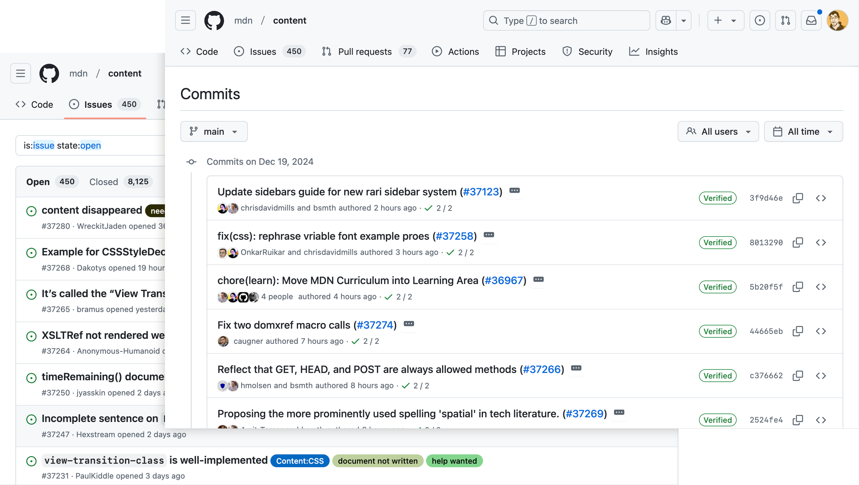
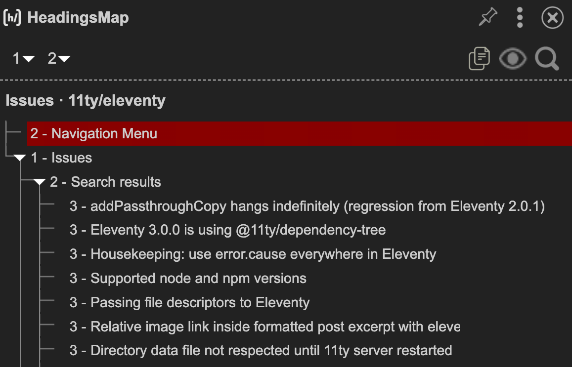
GitHub has updated the page template used to list Commits on a repository. Central to this experience is an interactive list component that I was responsible for architecting. This work was done alongside input from James Scholes, whose guidance was instrumental to the effort’s success.
An interactive list is a construct that’s more commonplace on desktop applications than the web. That does not mean its approach is forbidden from being used for web experiences, however.
What concerns does an interactive list address?
The main concern an interactive list addresses is when each discrete item in a series contains multiple interactive child elements.
Navigating through every child interactive element placed with each parent list item can be a tedious enough chore that it makes the effort a non-starter.
For example, if the list has ten items and each item has seven interactive child elements, that means it takes up to seventy Tab keypresses someone needs to perform to get what they need. That’s an exhausting experience to endure.
It could also be agonizing. Think motor control disabilities, where individual movements in aggregate can exceed someone’s pain tolerance threshold.
Making each list item’s container itself focusable and traversable addresses this problem, as it lowers the number of keypresses someone needs to use. It also supports allowing you to quickly jump to the start or end of the list for even more navigation options.
On GitHub, navigating an interactive list via your keyboard can be accomplished by pressing:
- Tab: Places focus on the interactive list item that last received focus. Defaults to the first item in the list if the list was previously not interacted with.
- Down: Moves focus to the next list item, if present.
- Up: Moves focus to the previous list item, if present.
- End: Moves focus to the last list item in the interactive list.
- Home: Moves focus to the first list item in the interactive list.
There’s a trick here: We want to make sure each list item’s announcement contains enough information that someone can make an informed choice when navigating via a screen reader. We also do not want to make the announcement so verbose that it slows down the navigation process.
For example, we only include the commit title when navigating via list item on the Commits page. For an Issue, we use:
- The Issue title,
- Its status, and
- Its author (there is currently a bug here, we’re working on fixing it).
There is an intentionality behind the order of content in this announcement, as we want to include the most pertinent information first. This, in turn, helps people navigating by list item announcement make more informed choices faster.

This lets us know:
- What the problem is,
- Has it been dealt with yet, and
- Who found the problem?
We also use the term “More information available below” to signal that someone can explore the list item’s child content in more detail. This is accomplished via pressing:
- Tab: Navigates forwards through each child interactive element in sequence.
- Shift + Tab: Navigates backwards through each child interactive element in sequence.
- Esc: Moves focus out of the child interactive elements and places it back on the parent list item itself.
Examples of child content that someone could encounter are an Issues’ author, its labels, linked Pull Requests, comment tally, and assignees.

Problems
The use of the phrase “More information available below” does not sit well with me, despite being the person who oversaw its inclusion. There’s a couple of reasons here:
First, I’m normally loathe to hardcode interaction hints for screen readers.
The interactive list component is a bit of an exception to that rule. It is an uncommon interaction pattern on the web, so the hint needs to be included until efforts to formalize it both:
- Manifest, and
- Get widespread support from assistive technology vendors.
Without these two things, I fear that blind and low vision individuals will not be able to fully utilize the experience the same way their peers can.
Second, the hint phrasing itself isn’t that great.
The location-based term “below” is shorthand to try and communicate that there’s subsequent child content that is related to the list item’s main content. While “subsequent child content that is related to the list item’s main content” is more descriptive, it’s an earful.
I am very much open to suggestions for a replacement phrase. And this potential for change sets up other things that weigh on me.
Bigger problems
Using this interactive list component on the Commits page template means there are now two main areas on GitHub where the component is present. The second being the lists of repository Issues for logged-in accounts.

Large, structural changes to a design’s underlying semantics disrupts the mental model and muscle memory of how many people who use screen readers operate an experience. It’s an act that I’m always nervous about undertaking.
The calculated bet here is that the prominence of the components on these high-traffic areas means that understanding how to operate them becomes easier over time. I’ve also hedged that bet by including alternate ways of navigating the interactive list, including baking headings into each Commit and Issue title.

I do think that this update to each page’s semantic structure is net better than what came before it.
However, it is still going to manifest as a large and sudden change for people who use screen readers. And for the record, I view changing the “More information available below” phrasing as another large and disruptive change.
Subsequent large and sudden changes is what I want to avoid at all costs.
That said, we’re running out the clock on a situation where an interactive list will someday contain non-interactive content. The component’s current approach does not have a great way for people to be aware of, and subsequently read that kind of content. That’s not great.
Because of this inevitability, I would like to replace the list’s interaction approach with the one we’re using for nested/sub-Issues. There are a few reasons for this, but the main ones are:
- Improving consistency and uniformity of interaction across all of GitHub for this kind of clustering of content.
- Leaning on more well-known interaction techniques for secondary content within an item by using dialogs instead of Tab keypresses.
- Providing a mechanism that can more easily handle exploring non-interactive content being placed within a list item.
Making these changes would mean a drastic update on top of another drastic update. While I do think it would be a better overall experience, rolling it out would require a lot of careful effort and planning.
Even bigger problems
In many ways, GitHub is a battleship. It is slow to turn just by virtue of the sheer size and scale of concerns it needs to cover.
Enacting my goal of replacing and unifying these kinds of interactions would take time:
- It would mean petitioning for heavy investment in something that may be perceived as an already “solved” problem.
- It also would require collaboration across multiple siloed product areas, each with their own pre-existing and planned objectives and priorities.
I have the gift of hindsight in writing this. The interactive list was originally intended to address just the list of repository Issues. Its usage has since has grown to cover more use cases—not all of them actually applicable.
This is one of the existential problems of a design system. You can write all the documentation you want, but people are ultimately going to use what they’re going to use regardless of if its appropriate or not.
Replacing or excising misapplied components is another effort that runs counter to organization priorities. That truth lives hand-in-hand with the need to maintain the overall state of usability for everyone who uses the service.
You’re gonna carry that weight
Making dramatic changes to core parts of GitHub’s assistive technology user experience, followed by more dramatic changes, then potentially followed by even more dramatic changes is an outcome we’re potentially facing.
It is the nature of software—especially websites and web apps—to change. That said, I worry about the overall churn this all could represent. I feel the weight of that responsibility as the person who set this course. I also feel the consequent pressure it exerts.
I’ll continue to write about and plead the case internally. However, I worry that I’ve blown my one chance to get things right. I know my colleagues who produce visual designs also may feel this way, but I also think it’s a more acute problem for digital accessibility.
I also don’t think that this sort of situation is one that’s talked about that often in accessibility spaces, hence me writing about it. This is to say nothing about quantifying it, either.
Centering
I’m pretty proud of what we accomplished, but those feelings are moot if all this effort does not serve the people it was intended to.
It’s also not about me. Our efforts to be more inclusive may ironically work against us here. How much churn is the point where it’s too much and people are pushed away?
To that point, feedback helps. Constructive reports on access barriers and friction are something that can bypass the internal perception of the things I’ve outlined as being seen as non-problems.
I am twice heartened when I see reports. First, it is a signal that means someone is still present and cares. Second, there has been renewed internal interest in investing in acting on these user-reported accessibility problems.
The work never stops
This post is about interactive lists on GitHub, and how to use them. It’s also about:
- The responsibilities, pressures, and politics of creating complex components like the interactive list and ensuring they are accessible,
- How these types of components affect the larger, holistic experience of GitHub as a whole,
- The need to ensure these components actually work for the people they serve, and
- The value of providing feedback if they don’t.
These are powerful things to internalize if you also do this sort of work, but also valuable to keep in mind if you don’t. The have served me well in my journey at GitHub, and I hope they help to serve you too.
