Naming things is hard.
One way to go about naming things is via topology, the practice of classifying things by way of their visual characteristics. It is a subtle art.
Topology is a good approach for the naming of design tokens. Unfortunately, in the context of design token name creation we are burdened by the tyranny of category. It demands distilling everything down to a single word, and consequently, a linear order.
Because of this, you need to craft a taxonomical structure that leads to results whose end point should be immutable:
This kind of codification is desirable because it creates:
- A more precise grammar,
- More easily-identifiable deviations from canonical values,
- Less ambiguity across one or more teams authoring and consuming the tokens, and
- Less overall maintenance.
A mature token name
Design token names can be as simple or as complicated as you need them to be. In my experience, it is best to start out simple, then grow them to meet the needs of your design system as it grows.
This approach takes advantage of one of the main benefits of design tokens: being able to target a canonically described quality distributed across one or more systems, and then modify it with an extreme degree of confidence.
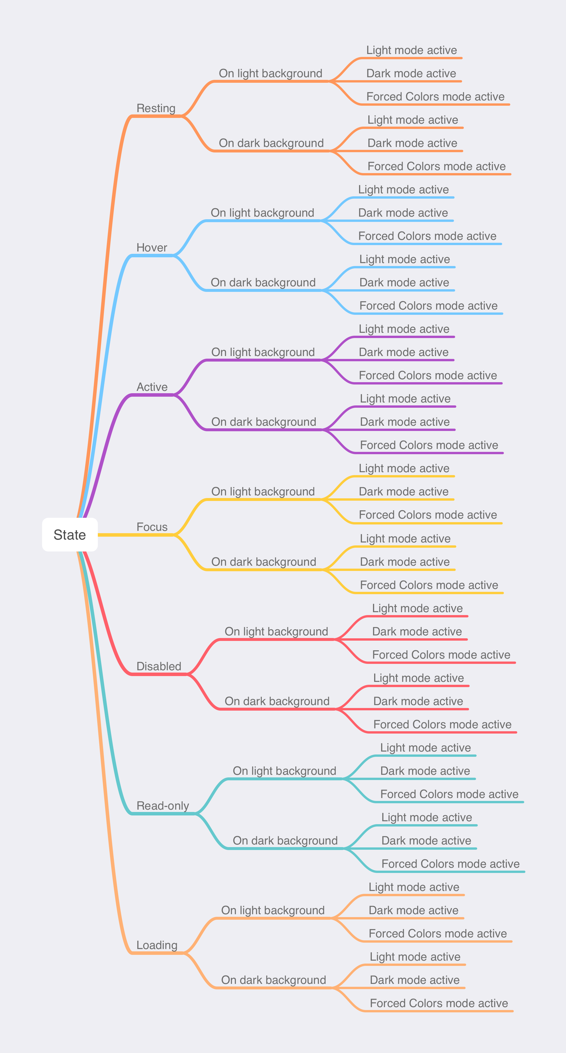
Mature token names are long, because they represent a ton of underlying abstraction. To help illustrate this, we'll identify a single token extracted from a text input component:

This token’s name is derived using the grammar of an established design system:
This approach follows advice laid out in Nathan Curtis’ brilliant post, Naming Tokens in Design Systems.
The token name might seem like a lot, potentially to the point of seeming absurd to you. However, I can assure you that in a large, mature design system that this level of detail is needed.
What I’m proposing has already been discussed by Nathan, notably this part:
Similarly, interfaces vary feedback color to alert the user of:
- success (aka
confirmation,positive)- error (aka
danger,alert,critical)- information (aka
info)warningnew
The design systems I work on have feedback-level considerations, so this definitely resonated with me.

In my experience, validation is oftentimes lumped in with user-facing state, so you’ll have valid/invalid values exposed at the same level as hover/active/focus values. I’m not so sure that’s a great idea.
Consider the following situation, where an invalid text input has a hover effect. How do we accommodate this?

What I’m proposing is where validation feedback should be placed in the token’s naming structure.
Where do you put validation feedback in a design token?
Remember: we want to whittle down our potential futures as much as possible.

Becasue of this, I propose that validation is placed after Type, and before State. This allows you to have a space where validation feedback can have user-facing state applied to it:
Interpolation
This is how our design token could be inserted into code. You’ll notice the Sass nesting strategy follows the token’s order of precedence:
.c-text-field {
  // 1. Import border color token into initial component-level properties
  --c-input-text-border-color: var(--core-color-border-textInput-default-solid-resting-onLightBg-lightActive);
  // Other initial component-level CSS Custom Property declarations

  border-color: var(--c-input-text-border-color);
  // Other initial component declarations

  &[aria-invalid] {
    // User-facing validation state styling

    &:hover {
      // 2. Redefne our border color with an updated token
      --c-input-text-border-color: var(--core-color-border-textInput-default-solid-invalid-resting-onLightBg-lightActive);
    }
  }
}
And here’s how our token’s structure would translate to use it in English:
In our Core design system, what is the color value for the hover state of a solid border of a regular text input with invalid content placed on a light background while Light Mode is active?
I quite like the “translate it into English” bit, in that it helps inform a shared vocabulary to verbally communicate the totality of consideration to your peers in a consistent way.
So, there you have it: Codified and encapsulated validation state.
Further reading
- Naming Tokens in Design Systems EightShapes
- sturobson/Awesome-Design-Tokens GitHub
- The context dilemma: Design tokens and components Frontside